
How I Help Businesses Make Better Decisions with Data! Inconsistent sales are rarely about “lazy salespeople” or “bad ads.”
Most of the time, they’re actually a data problem.
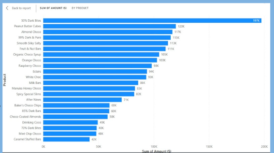
In this post, let me walk you through a real business case where I helped a specialty chocolate brand make better decisions with data. Their products looked just like the ones in your attached chart: 50% Dark Bites, Peanut Butter Cubes, Almond Choco, 99% Dark & Pure, Smooth Salty Bites, Fruit & Nut Bars, Orange Choco Snaps, and more – each selling differently week to week.
The goal wasn’t just to “make a nice dashboard.”
The goal was to diagnose why sales were inconsistent and then optimize.
The business problem: same effort, different results
The company came to me with a simple but painful complaint:
“We push promotions, run campaigns, and brief the sales team… yet some weeks we hit targets and some weeks we don’t. We don’t know why.”
They had:
- Transaction data from POS systems
- Product catalog
To answer those questions, we had to fix something first: the data itself.
Step 1: Cleaning and preparing the data
When I first opened their raw data in Python, three issues jumped out:
- Messy product names
“50% Dark Bites”, “50% Dark Bites”, and “50% Dark Bite” all appeared as different products.
That made it look like there were more unique items than there really were, and it split sales across duplicates. - Missing and inconsistent dates
Some transactions had no dates, others had invalid formats. You can’t analyze trends over time if the timeline is broken. - Outliers and suspicious records
A few orders showed unrealistic quantities and amounts, clearly due to data-entry errors.
Using Python (pandas), I:
- Standardized product names by trimming spaces, matching variants, and mapping them to a clean product master list.
- Converted and validated dates, removing or correcting impossible values.
- Flagged potential outliers based on statistical rules and business logic, then reviewed them with the team before excluding or adjusting.
Only after that did we start seeing a reliable picture: top sellers like 50% Dark Bites really were driving the bulk of revenue, but some mid-tier items such as Raspberry Choco, Eclairs, and Milk Bars had volatile week-to-week patterns.
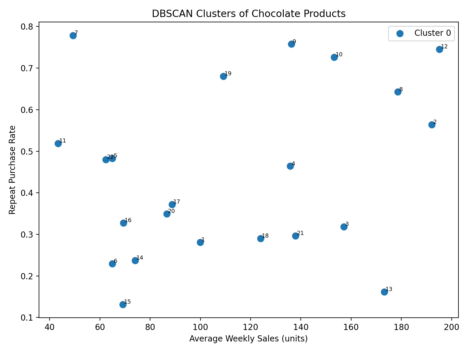
Step 2: Diagnosing the pattern with DBSCAN
The next question was:
“Are these inconsistent sales just random, or are there hidden patterns – for example, certain product mixes or customer types that behave differently?”
For that, I used DBSCAN, a density-based clustering algorithm in Python.
DBSCAN is powerful because:
- It doesn’t force the data into a fixed number of clusters.
- It can identify noise – data points that don’t clearly belong to any group (often where the problems hide).
Using features like:
- Product category (e.g., Dark, Milk, Nutty, Premium)
- Average discount level
- Sales volume over time
- Number of repeat purchases and basket size
DBSCAN grouped products and time periods into natural clusters:
- Stable performers: items like 50% Dark Bites and Peanut Butter Cubes that sold consistently across weeks.
- Promotion-dependent items: products that spiked only when heavily discounted or featured (e.g., special flavors like Raspberry Choco or Orange Choco Snaps).
- Underperformers: items that rarely appeared in baskets unless bundled or discounted heavily, like some niche variants and Caramel Stuffed Bars.
The “noise” points – data that DBSCAN treated as outliers – often fell in weeks where:
- Stock-outs occurred (product not available but still on the price list)
- Promotions ran in some regions but not others
- Data entry was incomplete
By mapping these clusters back to the calendar and product list, the sales team suddenly saw that their “inconsistent sales” actually followed a structure: certain products behaved predictably, others were hyper-sensitive to promotions, and a few were dragging down the overall category.
Step 3: Bringing it to life in Power BI
Technical analysis is useless if decision-makers can’t see it.
So the next step was to turn the Python and DBSCAN outputs into interactive visuals in Power BI, similar to your attached chart, but smarter.
In Power BI, I built:
- Product performance ranking
A bar chart , showing products ordered by revenue – 50% Dark Bites at the top, followed by Peanut Butter Cubes, Almond Choco, and others – but now color-coded by DBSCAN cluster:- Stable performers
- Promotion-dependent
- Underperformers
- Outliers
- Time-based trend view
A visual that let them click on any product and see its weekly sales line.
Instantly, they could see whether a product’s sales line was smooth (stable) or spiky (promotion-driven). - Promotion and discount impact
A page showing how different discount levels affected sales for each cluster. This made it clear that some products responded strongly to even small discounts, while others barely moved.
Non-technical managers could now explore their data without needing to know Python, clustering, or algorithms. They just saw:
“Green bars are stable, orange bars spike only during promos, red bars underperform.”
Step 4: Optimization – turning insights into action
Diagnosis is one thing; optimization is where the return on investment comes from.
Based on the clusters and Power BI insights, we implemented several changes:
- Focused promotions on the right products
Instead of discounting everything, the company:- Prioritized promotion-dependent items like flavored chocolates (Raspberry Choco, Orange Choco Snaps) during specific seasons.
- Reduced discounting on already stable products like 50% Dark Bites, which sold well even without heavy promotions.
- Rationalized the product portfolio
Underperforming products that rarely sold and confused customers were either:- Repositioned (bundled with top sellers), or
- Gradually phased out.
- Improved inventory planning
By understanding which products behaved predictably, the planning team could:- Stock stable sellers at reliable levels.
- Prepare extra stock for promotion-sensitive items only when specific campaigns were scheduled.
Over the following periods, sales didn’t just “go up.”
They became more predictable. Targets were easier to set and hit because the business finally understood how each product contributed to overall performance and under what conditions.
How this helps your business
If your business is facing inconsistent sales, the root cause might not be your team’s effort at all. It might be:
- Dirty, inconsistent data that hides real patterns
- No clear segmentation of products or customers
- Dashboards that show numbers, but not behavior
Here’s what working together typically looks like:
- Audit and clean your data (sales, products, channels, campaigns).
- Explore and cluster behavior using Python and algorithms like DBSCAN.
- Translate the findings into clear, interactive Power BI dashboards.
- Turn insights into concrete actions on promotions, pricing, inventory, and product mix.
The result is the same goal that drove this chocolate brand project:
better decisions, less guesswork, and more consistent sales.
If you have digital/IT struggle in your business, we can fix your business problems into actionable insights. Get a quote today!